One year ago, we became the Belonging Network—a name that better reflects the diverse audience we serve. In this behind-the-scenes look, Lisa Eaton, Director of Operations at Affinity Bridge, shares how her team collaborated with us to develop a brand that brings our mission to life.
Renaming and rebranding exercises are exciting. Not just because we get to create something new, but because we get to go on a journey to help an organization capture the essence of who they are.
We were fortunate to be given the opportunity to help reposition the Belonging Network (at the time it was called the Adoptive Families Association of BC) to more accurately represent who they are and what they do. Working with their team was particularly special because the motivation for the rebrand was both personal and universal. Our collective goal: to communicate the breadth of their support services for families and youth in a clear and memorable way.
Listening is essential
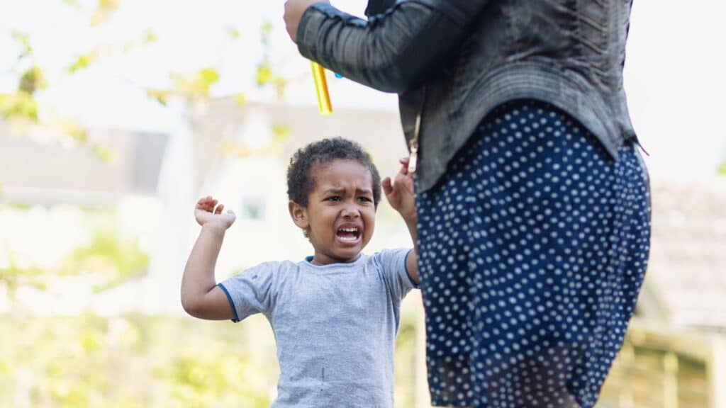
We began the project with extensive consultation with invested parties—from members, donors, and youth to leadership and the Board. Executive leadership spoke of the desire for a new name and brand for the organization that showcased their revitalized purpose and vision as a hub for youth from foster care and permanency families of all kinds. Members and donors shared their stories with us, and youth shared their guidance with us. Many spoke of the journey towards truth and reconciliation with Indigenous peoples.
A welcome transformation
We know how important language is. The words we choose to use can be isolating, or they can make us feel safe. The team wanted to move away from the original name’s singular focus on adoption, and demonstrate cultural sensitivity as well as celebrate all the different types of permanency, including kinship care, Indigenous customary care, and guardianship.
Our team of strategists and creatives worked closely with interest-holders to understand the language used in this line of work and the sensitivities around specific wording. As we expanded and refined name options, one word that repeatedly surfaced through the research phase, and continued to resonate as we explored options more deeply through consultation, was belonging.
“Fitting in is about assessing a situation and becoming who you need to be to be accepted. Belonging, on the other hand, doesn’t require us to change who we are; it requires us to be who we are.” – Brené Brown
A brand new look and feel
Following the creation and approval of the Belonging Network name, we turned our focus to the visual identity, which was an opportunity to express what we had learned along the way. It was also where the Belonging Network’s values came to life: diversity, inclusion, and community are core to the logo’s connected shapes and welcoming colours.
To deliver a first impression that captured what the Belonging Network is all about, we also gave thoughtful consideration to what they are not. The Belonging Network is not an adoption or government agency, so it was important for the logo design to have a grassroots feeling. From static to dynamic and separate to overlapping, connected circles and a balanced colour palette add visual interest and movement, helping to reinforce the values of trust, empathy, community, and belonging.
Building connections
We had a great time collaborating with the Belonging Network’s team on this project. The rebrand has helped align the organization with its purpose and the members it serves. We are excited to follow their next chapter and celebrate their dedication to supporting permanency families and youth across British Columbia and beyond.
If you’re interested in the nuts and bolts of our naming and branding process, you can read more about it in Affinity Bridge’s Belonging Network: Support for Youth case study.